Accessibility as the Bare Minimum: Frontend Engineer's Guide
Building Accessible Websites: The Engineer's Guide to Not Locking People Out
Hey there, fellow Coding Chefs! 👋
You've shipped a beautiful product. The animations are smooth, the gradients are great, the Lighthouse performance score is a proud 94. Marketing is happy. Your PM is already talking about the launch tweet. You close your laptop feeling like a rockstar.
Then Monday morning, someone on your team pulls up the same site on a Tecno phone, outside, in the middle of a busy market. The sun is doing what a hot sun does. They squint. They tap. The button they need is there, technically, but the text on it is a soft grey on a slightly-softer grey, and between the dust, the glare, and the trader calling them back to the stall they were buying tomatoes from, they give up and close the tab.
Your app didn't crash. It didn't throw an error. It just quietly failed a real person.
As engineers who work on products that serve a wide variety of users, we're often blinded by our own context. We build on a 27-inch monitor in an conditioned environment. We test in Chrome DevTools. We assume the user is sitting still, with both hands free, looking at a 100% zoomed screen, on fibre internet, with perfect eyesight and no distractions.
But your user is somewhere else entirely.
They're in the crowded aisles of Tewure market in Ogbomoso, trying to pay a vendor before the queue behind them becomes an angry chorus. They're in the organised, air-conditioned comfort of a mall in Lekki, but they're holding a baby in one arm and a card in the other, trying to complete a checkout with one thumb. They're at a party in a Victoria Island club at 1AM, under strobing RGB lights, trying to split a bill with friends on the app you built. They're in a Danfo bus at 6PM, standing, hanging off a strap with one hand, squinting at the phone in the other.
And they all need your thing to work. Fast. In fewer clicks. With text they can actually read.
This is what accessibility really is. It's not a compliance checklist. It's not something you "add at the end." It's the floor you build everything else on top of. The minimum. The bare minimum.
Let's get cracking (or cooking),
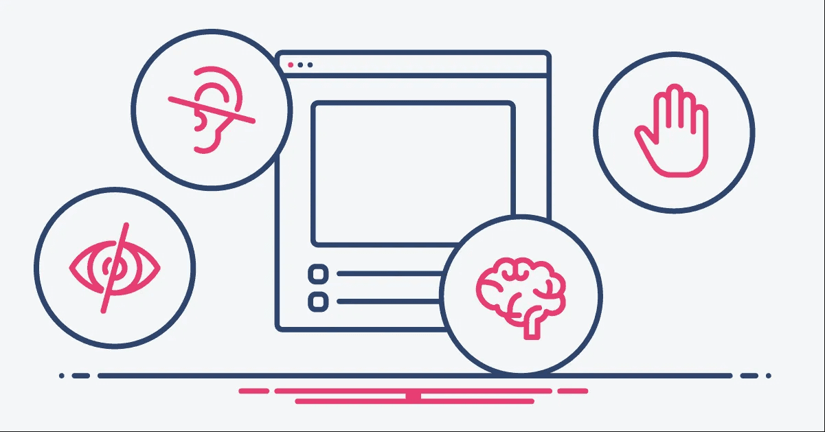
Why This Matters (Beyond the Obvious)
Most engineers I've met hear "accessibility" and their brain immediately jumps to one image: a blind user with a screen reader. And yes, that user exists, that user matters, and we'll get to them. But that mental model is what makes a11y feel like a niche concern, a nice-to-have, something for the 1%.
It isn't.
Here's the mental shift I want you to make: stop thinking about "disabled users." Start thinking about constraints.
Constraints come in three flavours:
Permanent — a user who is blind, or has low vision, or motor impairment, or is colorblind.
Temporary — a developer who just had LASIK and can't see the screen clearly for a week. A friend with a broken wrist who's typing one-handed.
Situational — and this is the big one. Every single person is situationally constrained all the time.
Bright sunlight is a visual impairment. A screaming toddler is a cognitive impairment. One-handed scrolling on a Danfo bus is a motor impairment. Trying to read a receipt under RGB strobe lights at Quilox is a visual impairment. A terrible 3G signal in a rural area is a bandwidth impairment that makes your fancy fonts not load, exposing whatever fallback stack you didn't think about.
Every pattern that helps the "permanent" user also helps the "situational" one. The blind user's screen reader announces your button text — and the sighted user in bright sunlight who can only read high-contrast text benefits from the exact same semantic markup that made the announcement possible.
Accessibility is universal design. When you build for the edges, you make the middle better for free.
I had to learn this the hard way.
I once shipped a modal on a project. It was stunning. Soft blurred backdrop, gentle 200ms fade-in, a close button in the corner that was just an × character in a light grey. I was proud of it. Design loved it. It passed every code review.
A month later, a user emailed support saying he couldn't close the modal. Couldn't click the X. Turned out he was on an Android phone, at work, in a warehouse with terrible fluorescent lighting, and he literally could not see the close button. The grey was too light. The touch target was too small. And because I'd built the modal with a <div> (more on that sin in a moment), the Esc key did nothing.
The fix took me 15 minutes. The damage, a user who walked away from a feature we spent three weeks building, was much longer.
Accessibility isn't a feature you add. It's a floor you build on.
Semantic HTML: The Foundation Everyone Skips
If you learn nothing else from this article, learn this: use the right HTML tag.
Most accessibility problems I've seen in the wild aren't solved with ARIA attributes, or screen reader testing, or expensive tooling. They're solved by replacing a <div> with a <button>.
Here's the original sin of modern frontend:
// Please don't do this
<div className="btn" onClick={handleSubmit}>
  Submit
</div>
This looks like a button. It behaves like a button if you're a sighted user with a mouse. But:
It's not focusable with the Tab key
It doesn't trigger on Enter or Space
A screen reader announces it as "Submit" (just text, not a button)
It doesn't get the browser's default button semantics
You now have to reimplement all of that by hand
The fix:
<button type="button" onClick={handleSubmit}>
  Submit
</button>
One tag change. You get keyboard focus, Enter and Space activation, screen reader announcement as "Submit, button," disabled-state handling, and form integration — all for free. Free. The browser was always going to give you this. You just refused to accept it.
Here's your cheat sheet of swaps:
Use
<button>for anything that performs an action. Not<div>. Not<span>. Not<a>without anhref.Use
<a href="...">for anything that navigates. Not<div onClick={navigate}>.Use
<input>and<label>for form fields. Always paired. Always.Use
<nav>,<main>,<header>,<footer>,<aside>,<article>to structure the page. Screen readers let users skip straight to these landmarks.Use
<h1>through<h6>in order. Don't pick<h3>because you like how it looks — style the<h1>.
If you catch yourself typing <div role="button">, stop, delete that, and type <button>. If you find yourself typing <div role="navigation">, delete that, and type <nav>. The tag already exists. Use it.
Keyboard Navigation: The Test That Catches 60% of Your Issues
Here's the cheapest, most humbling test you can run on your own website. Ready?
Unplug your mouse. Put your trackpad hand behind your back. Try to use your app with only the keyboard.
Tab, Shift+Tab, Enter, Space, Escape, arrow keys. That's it. That's your whole toolkit now.
If you can't get from the homepage to completing a purchase using only those keys, congratulations, you've just found out what your screen-reader users feel every day.
Here's what usually breaks:
Focus disappears. You Tab into a modal and suddenly have no idea where the focus ring is. Someone removed the default blue outline with
*:focus { outline: none }because it "looked ugly" and forgot to add one back.Focus escapes modals. You open a dropdown or a dialog and Tab takes you to an element behind it. Focus should be trapped inside until the modal closes.
Tab order is chaos. Your visually-linear form jumps from the first name field to the footer to the third step because someone used
position: absoluteand CSS grid to rearrange the DOM.Custom controls are dead. That slick custom dropdown you built with
<div>s? Tab skips right over it. Or worse, lands on it and does nothing.
The fixes, in order of effort:
1. Never remove focus styles without replacing them.
/* The war crime */
*:focus { outline: none; }

/* The minimum acceptable replacement */
*:focus-visible {
  outline: 2px solid #2563eb;
  outline-offset: 2px;
}
Use :focus-visible instead of :focus so the ring only shows up for keyboard users, not mouse clicks. Best of both worlds.
2. Trap focus inside modals.
When a modal opens, focus should move into it and stay there until it closes. Here's the minimum vanilla version:
function trapFocus(modalElement) {
  const focusable = modalElement.querySelectorAll(
    'button, [href], input, select, textarea, [tabindex]:not([tabindex="-1"])'
  );
  const first = focusable[0];
  const last = focusable[focusable.length - 1];

  modalElement.addEventListener('keydown', (e) => {
    if (e.key !== 'Tab') return;
    if (e.shiftKey && document.activeElement === first) {
      e.preventDefault();
      last.focus();
    } else if (!e.shiftKey && document.activeElement === last) {
      e.preventDefault();
      first.focus();
    }
  });

  first?.focus();
}
In React, just use a library — react-focus-lock or the built-in focus management in Radix UI, React Aria, or Headless UI. Don't roll your own unless you're writing a component library.
3. Add a skip link.
At the top of your page, invisible until focused:
<a href="#main" class="skip-link">Skip to main content</a>
Your keyboard users will thank you. Tab once, Enter, and they skip past your 40-item navigation menu.
4. Make sure everything interactive is reachable.
If your Tab key doesn't land on a custom control, something is wrong. Either use a real <button> or <a>, or you're going to need tabindex="0" plus a pile of ARIA and keyboard handlers — and at that point, please, please just use the semantic HTML.
The keyboard test takes 5 minutes and catches the majority of real accessibility bugs. Do it before every major feature ships.
ARIA: Useful, Dangerous, and Mostly Unnecessary
ARIA stands for Accessible Rich Internet Applications. It's a set of attributes you can add to HTML to give extra semantic information to assistive technology. Things like role="dialog", aria-label="Close", aria-expanded="true".
Here's the thing nobody tells juniors:
The first rule of ARIA is: don't use ARIA.
Or, more precisely: no ARIA is better than bad ARIA. And most ARIA is bad ARIA.
The reason is that ARIA doesn't do anything by itself. It doesn't add behaviour. It just tells screen readers what to say. If you add role="button" to a <div>, you've told the screen reader it's a button — but you haven't made it focusable, haven't made it respond to Enter or Space, haven't made it look like a button. You've just lied to the screen reader. The user will now try to press the button, nothing will happen, and they'll leave.
That's worse than no ARIA at all.
So the workflow is:
Use the right semantic HTML. Can you use
<button>? Use<button>.If semantic HTML can't express what you need, then add ARIA.
If you add ARIA, make sure you've also added the behaviour it implies.
When do you actually need ARIA?
Live regions for dynamic updates the user should hear:
<div aria-live="polite" aria-atomic="true">
  Your cart has 3 items.
</div>
When the text inside changes, a screen reader announces it without the user having to navigate there. Useful for toast notifications, form errors, live search results.
Labels for icon-only buttons:
<button aria-label="Close modal">
  <svg>...</svg>
</button>
Without the aria-label, a screen reader says "button." With it, "Close modal, button." Night and day.
Expanded/collapsed state for custom disclosure widgets:
<button aria-expanded="false" aria-controls="menu-items">
  Menu
</button>
<ul id="menu-items" hidden>
  ...
</ul>
Update aria-expanded in JavaScript when the menu opens. Screen readers will announce the state change.
Paired example, because this is where people go wrong the most:
// Bad ARIA — lying to the screen reader
<div role="button" onClick={handleClick}>
  Save
</div>

// No ARIA, just correct HTML — the right answer
<button onClick={handleClick}>
  Save
</button>
You didn't need ARIA. You needed the tag that already exists.
Colour, Contrast, and "I Can't Read This Under the Sun"
Remember our friend in a busy market? This section is for them.
WCAG (the accessibility standard) specifies minimum contrast ratios between text and background:
4.5:1 for normal body text
3:1 for large text (18pt regular or 14pt bold and up)
3:1 for non-text elements like icons and form borders
That means if your body text is #888 on a #FFF background (a contrast of about 3.5:1), it fails. Looks nice on your Macbook in a dark office. Unreadable on a Tecno Spark in Ogbomoso at noon.
The test is not "does it look readable to me right now." The test is "does it meet the ratio, objectively."
Quick ways to check:
Chrome DevTools — hover over any text in the Elements panel, click the colour swatch, it shows you the contrast ratio and tells you whether it passes AA or AAA.
axe DevTools extension — free, audits your whole page, flags contrast failures with line numbers.
Lighthouse — built into Chrome, runs a full accessibility audit.
A few more rules that come up a lot:
Don't rely on colour alone to convey information. The classic sin:
<!-- Bad: only red tells the user this is an error -->
<p style="color: red">Your email is invalid</p>

<!-- Better: colour AND an icon AND clear text -->
<p class="error">
  <svg class="error-icon">...</svg>
  Your email address is missing an @ symbol
</p>
A colorblind user sees two identical grey paragraphs otherwise. A user in bright sunlight sees two identical washed-out paragraphs. The icon and the text do the heavy lifting; the colour is a bonus.
Design for the dim environments too. Your user at the club party with RGB lights bouncing off the screen needs high-contrast, chunky text. Your user at 2AM in bed needs the opposite. Support dark mode. Support system font sizes. Don't fix the font size to 12px because it "looks more refined" — let the browser scale.
Test at 200% zoom. Open your app, Cmd + a bunch of times, see if your layout breaks. It probably will. A non-trivial number of users browse at 150-200% zoom by default, and they are often the users with the most disposable income (they're older). Breaking the layout at zoom means losing them.
Forms: Where Accessibility Goes to Die
Forms are the single highest-value accessibility target in any app. Every checkout, signup, login, and onboarding funnel is a form. If forms are inaccessible, the business loses money directly.
Here's the non-negotiable checklist.
1. Every input needs a real label.
Not a placeholder. A label.
<!-- Wrong: placeholder as label -->
<input type="email" placeholder="Email address" />

<!-- Right -->
<label for="email">Email address</label>
<input id="email" type="email" />
Placeholders disappear the moment the user starts typing. If they get distracted (and remember, they're in a Danfo, holding a baby, at a club, with screaming toddlers), they now have no idea what the field is for. Real labels stay.
2. Errors must be announced, not just shown.
<label for="email">Email address</label>
<input
  id="email"
  type="email"
  aria-invalid="true"
  aria-describedby="email-error"
/>
<p id="email-error" role="alert">
  Please enter a valid email address
</p>
The aria-describedby links the error to the input, so when the user focuses the field, their screen reader reads both the label AND the error. The role="alert" makes the error announce itself the moment it appears.
3. Required fields need words, not just asterisks.
<!-- Incomplete -->
<label for="name">Name *</label>

<!-- Complete -->
<label for="name">Name <span class="required">(required)</span></label>
<input id="name" required aria-required="true" />
A red asterisk alone is useless if you're colorblind and your screen reader doesn't announce the styling.
4. Touch targets need to be big enough.
Minimum 44x44 CSS pixels for anything tappable. Your user is in a Danfo, the bus just hit a pothole, their thumb is wide, and the checkout button is an 18px-tall sliver. They miss. They tap the "Delete account" button next to it instead. You just lost a customer and maybe a lawsuit.
Give things room.
5. Don't trap users in broken states.
If a user tries to submit a form and there are errors, don't just highlight the fields in red and leave them to guess. Scroll to the first error. Focus it. Announce it. Make it trivial for them to fix and retry.
Images, Media, and the Alt Text Problem
Alt text rules are simpler than most people think:
Informational images (product photos, charts, diagrams) — describe what they convey. "A red Toyota Corolla 2020 model, front three-quarter view."
Decorative images (background textures, divider illustrations) — empty alt:
alt="". Not missing. Empty. An empty alt tells the screen reader "skip this." A missing alt tells it "read out the filename," which is how your users end up hearing "IMG underscore 2847 dot J P G."Functional images (an icon inside a link) — describe the action. An envelope icon inside a link to
/contactgetsalt="Contact us", notalt="Envelope".Images of text — just don't. Use real text. If you must (a logo), the alt text is the text in the image.
The Nigerian angle here is real: on flaky 3G, your images often don't load at all. Good alt text isn't just for screen readers — it's what appears in the broken-image box, which is what half your users in bad-signal areas will actually see. It's the only content your site has in that moment. Make it count.
For video and audio:
Video needs captions (for deaf users, and for everyone watching in public without headphones).
Audio needs transcripts (for deaf users, and for everyone who wants to skim instead of listen).
Autoplay with sound is evil. A user opening your page in a quiet office, or at night beside a sleeping partner, or in a lecture hall, will never forgive you.
mutedor nothing.
Testing: What You Actually Have to Do
Here's the unglamorous truth: automated tools catch about 30% of accessibility issues. The other 70% needs a human.
But that 30% is cheap and you should absolutely start there.
Automated tools:
axe DevTools — free browser extension. Run it on any page, get a list of violations with line numbers and fixes. Use this religiously.
Lighthouse — Chrome DevTools → Lighthouse tab → Accessibility category. Gives you a score and a punch list.
Pa11y — CLI tool for CI integration. Add it to your pipeline and fail the build if new accessibility errors show up.
ESLint plugins —
eslint-plugin-jsx-a11ycatches a lot of issues at the code level, before they ever ship.
Manual tests you should do before every major release:
Keyboard only. The test from earlier. Tab through the entire user flow. Can you complete it?
Screen reader. On Mac, VoiceOver is built in — press Cmd+F5. On Windows, download NVDA, it's free and excellent. On Android, TalkBack is in accessibility settings. Just spend 10 minutes navigating your own app with it. The first time you do this, it will change how you build forever.
200% zoom. Cmd+ a bunch of times in the browser. Does the layout hold? Does text get clipped?
Sunlight test. Take your laptop outside, in bright sun, and try to use the site. I'm not kidding. This is the single best test for contrast, and it doesn't require any special tooling.
One-handed test. Pick up your phone, put your other hand behind your back, and try to complete a key flow. Can you reach the primary CTA with your thumb? Or is it in a corner you need two hands to hit?
Doing these five tests once a sprint catches more real bugs than every automated tool combined.
What I'd Do Differently
Looking back on the projects where I've shipped accessibility debt, there's a clear pattern: accessibility was always treated as a "phase 2" item, something we'd "get to after launch." And then, like all phase 2 items, it never happened, or it happened badly, or it happened two years later when someone on the team got annoyed enough to retrofit it.
Retrofitting accessibility is an order of magnitude more expensive than building it in.
If I were starting a new project today, I'd do three things differently:
1. Treat semantic HTML as a non-negotiable from day one. Every <div onClick> in PR review gets rejected. Not discussed. Not "we'll refactor later." Rejected. It costs the engineer 15 seconds to change. It costs the company weeks to retrofit later.
2. Add an accessibility checklist to the PR template.
## Accessibility
- [ ] Keyboard-navigable end-to-end
- [ ] Focus states visible on all interactive elements
- [ ] Form inputs have real labels
- [ ] Colour contrast passes WCAG AA
- [ ] axe DevTools run, no new violations
- [ ] Tested at 200% zoom
Six checkboxes. Maybe five minutes per PR. It builds the muscle.
3. Do one real screen reader test per feature. Not a full audit, just ten minutes with VoiceOver before calling something done. The number of bugs this catches, silently, before they ship, is ridiculous.
One project I was on shipped a "revamped" dashboard. We had beautiful charts, great animations, a lovely dark mode. Three weeks after launch, a user wrote in to say the whole dashboard was unusable on a screen reader every chart was an unlabelled canvas, every filter was a styled div, the whole thing announced as "blank, blank, blank." Fixing it took three sprints. Building it right the first time would have taken maybe three extra days of planning and one day of extra implementation.
That's the real cost of treating accessibility as phase 2. Not the ethics, not the compliance — the pure engineering waste.
The Honest Conclusion
Your user isn't sitting at a 27-inch monitor in a quiet office.
They're in a market in Ogbomoso, trying to pay before the next customer shoves them aside. They're in a club in Lekki, under strobing lights, trying to split a bill. They're on a Danfo bus at rush hour, holding a strap, trying to check if their transfer cleared. They're in a mall in Ikeja with a toddler on their hip, tapping through a checkout with one thumb. They're at home at 2AM, half-awake, trying to order food without waking their partner.
Some of them are blind. Some of them are colorblind. Some of them are temporarily one-handed because they just came from the hospital. Some of them just forgot their glasses at the office. Some of them are fine, they're just tired.
Every single one of them is using your app under conditions you never tested for. And accessibility isn't some charitable concession you make for "other people." It's the minimum, the floor, the thing that has to be there before anything else you build on top of it can actually reach the people you built it for.
You don't need to memorise every ARIA attribute. You don't need to become an a11y expert. You just need to care enough to do the five-minute keyboard test, to use the button tag instead of a div, to pick a colour that passes contrast, to write a real label, to run axe once before you ship.
Most users you lock out won't email you. They'll just leave. Quietly. Permanently.
Accessible websites aren't harder to build. They're just built differently from the start.
Build for the market, the mall, the club, the Danfo, the couch at 2AM. Build for everyone, because that's who's actually using the thing.
Bye.